FINDHER
How can we empower women in India to close the gender employment gap?
CONTEXT
FindHer is a job search web-app that empowers women in India to search for employment and enter the workforce. The web-app is unique for its dating app-like matching where both job applicants and businesses can be users and determine top matches with the other sides’ profiles.
My Role
Desk Research,
User Interview Script & Note-taking,
Logo Design & Brand guide,
Wireframing and design of core pages
Timeline
Jan 2023 - Apr 2023
Team
5 Designers
7 Developers
1 Project Leads


PROBLEM
In 2020, the Labor Force Participation Rate (percent of people either employed or actively searching for a job) was 24.8% for women in India compared to 72% for men in India. A major reason for this stark difference is the stigmatization of working women in India, leaving women to care for the household instead of pursuing career growth. Even when employed, women are still expected to take on the brunt of household and family responsibilities, causing companies to view women as less dependable when it comes to work.
How might we design a platform that prioritizes transparency and lets applicants/companies show a whole picture of themselves?
SOLUTION
A job search web-app that finds optimal matches between applicants and businesses so that applicants are not blindsided by the reality of their job.
01
Questionnaire that makes applicants' needs and priorities transparent to companies.


02
Dating app-like profiles for both applicants and companies to show off their personalities and lesser-known information.
03
Company profiles display their benefits and culture upfront, giving transparency to applicants.

OUR APPROACH
When designing in a collaborative team, It's crucial to include stakeholders in the design process. Document and create research reports, checking features' feasibility with engineers, and verifying design progress & details with the product lead/manager are all indispensable. Communicating with them is one of the keys to my design approach.

COMPETITIVE ANALYSIS
We started by doing research on what could make FindHer stand out. We compared several job platforms ranging from those specifically for Indian women to LinkedIn.Below were the major takeaways.
What competitors lack
1. In-depth search functions for Indian women (ex. Diwali Bonus, Maternity Leave, etc.)
2. Personalized matches between applicants and companies
3. Transparent job application process.
What could influence FindHer
1. Providing outside resources like articles, workshops, etc for career growth and break into the field
2. Being able to view company profiles

USER INTERVIEWS
In order to understand the pain points of our intended users, we interviewed 4 Indian women currently working in India, and to prepare, I worked with another designer to research best practices for interviews and craft a script. We mainly sought insight into the job platforms these women were using and how the platforms could be improved.
Applicants want a comprehensive profile and seek transparency from companies.
Some questions we asked
1. Can you tell me how and where you found out about your current position?
2. What specific characteristics were you looking for in positions during your last job search?
3. What are you looking to showcase about yourself when applying for jobs?
Pain points & Findings
1. Lack of personal touch with applications ➡ Applicants want to show off their personalities and whole selves more
2. Lack of communication throughout the application and interview process ➡ The interview process should be more transparent
3. The company's impact and benefits for women should be clear
4. Uncertainty about how to proceed in various professional situations (ex. How do I write an acceptance email?) ➡ Career development resources should be included
USER FLOW
We re-mapped out how the applicant and business user flows would look based on the client's existing flow. Creating these flows was very useful in helping us understand how all the features would fit together and how the two flows differ.
EMPLOYEE FLOW

BUSINESS FLOW

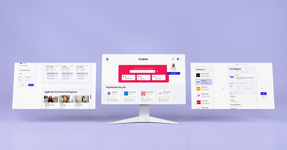
WIREFRAMES
I applied insights from the interviews to design layouts including pictures and video statements to show off the employee’s/business’s personality. I took inspiration from dating apps like Hinge and Bumble to make the profiles feel personable and comprehensive. I also wanted the profiles to be compact so they could be easily scanned.
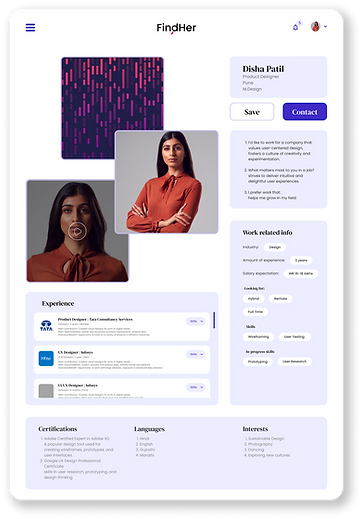
Applicants and Business Profiles


Iterating
After getting feedback from the team, we went with the first design since it emphasized the personal section (pictures and video statement) of the user the most.
Changes made between this and the final design include:
• Navigation bar was removed because of spacing issues and it wasn't necessary due to the compact layout
• "About" card was replaced with responses from the questionnaire so users' preferences are explicit
• Experience section became scrollable instead of opening another page to reduce page traveling

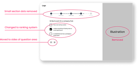
Applicant and Business Questionnaires
To break up all the questions into digestible sections, we created a click-through design. The responses made here would be shown on the users' profiles, so each question was isolated for better focus. We also initially explored a vertical scrolling design but decided a click-through version would be better to section each part off and avoid the overwhelming feeling of an endless scroll.


Iterating
The following changes were made:
• Small dots between big dots of progress bar were meant to indicate each question but were removed for cleaner UI
• Ranking-type questions added in addition to multiple-choice for better profile matches
• Back and Next arrows were moved to both sides for a continuous flow
• Illustration was distracting and unnecessary

Job Seekers' Dashboard
The initial wireframes were created based on user interviews and identified user needs. However, during discussions with stakeholders and developers, it became clear that due to time constraints, it wouldn't be feasible to implement all the planned features. As a result, for the first version of the web app, we decided to prioritize the core features and set aside some of the secondary features.


MORE HI-FIDELITY DESIGNS


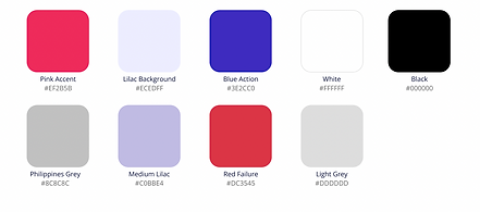
BRAND IDENTITY


CHALLENGES & TAKEAWAYS
• Large scope with multiple features that were all built from scratch ➡ Must stick to scope to prevent running off track and not reaching an MVP
• Confusion about some logistics of the product ➡ Client communication is crucial
WHAT I'D DO DIFFERENTLY
• Cut down on scope since the breadth took away from the depth, making it harder to polish each feature
• Conduct user testing to check how intuitive the product is and how branding is received