

Technical Software Redesign
Wopipe
From Friction to Flow:
Redesigning an Old Computer Vision Tool


Role:
Product Intern
Redesigned the whole interface and 20+ modules, conducted stakeholder interviews, and performed a user testing study
Team:
1 Designer
1 Developer
1 Project Manager
Timeline:
4 Weeks
Tools:
Figma
Organization:
Wobot.ai
Context
During my internship at wobot.ai, I was assigned an individual project to redesign the interface of internal software. I worked closely with stakeholders, developers, and a product manager to revamp "wopipe," a tool used by the computer vision engineering team.
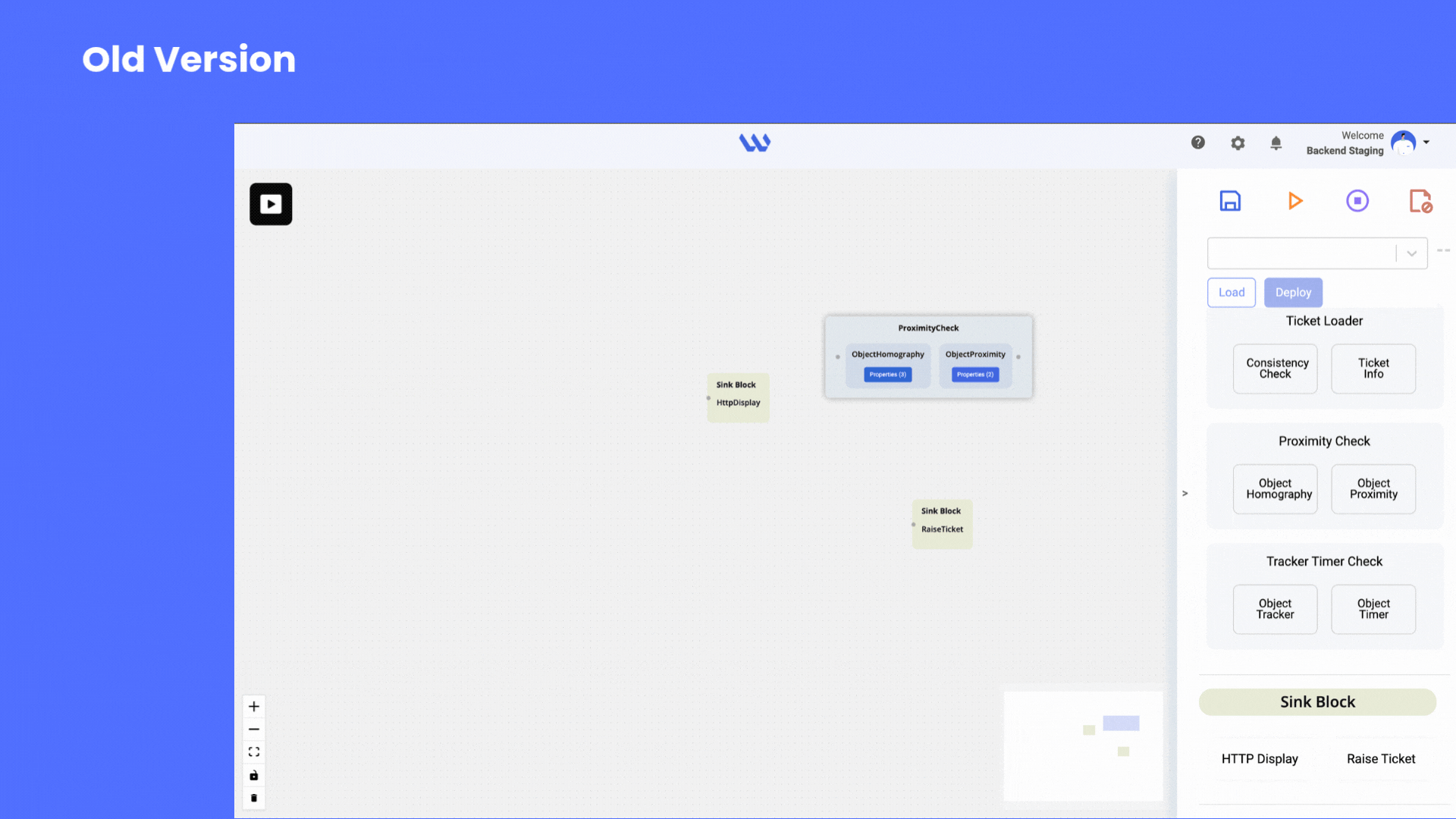
What's Wopipe?
Wopipe is the internal tool designed to help computer vision teams at wobot.ai to build, manage, and optimize pipelines—structured workflows that process visual data (such as video feeds from cameras) and transform it into actionable insights for businesses.
Why does the existing Wopipe frustrate users?
When we started this project, it was already clear that the computer vision team was frustrated with the existing Wopipe tool.
The interface was outdated, functionally and visually—more of a workaround than a solution.
The tool was powerful, but its inconsistent workflows
were slowing down even the most experienced users.

IMPORTANCE
WoPipe is the backbone of Wobot.ai’s computer vision operations, empowering their team to efficiently create and manage complex data pipelines. Its reliability and usability directly impact the speed and quality of AI-driven video analytics delivered to clients.
THE OPPORTUNITY
My first chance to lead a complete redesign—transforming not just an interface, but the daily experience of an entire computer vision team.
For Wobot.ai’s computer vision team to work at their best, Wopipe needed to be intuitive, consistent, and scalable.
THE JOURNEY: UNCOVERING HIDDEN PAIN POINTS
Initially, to understand how the tool works and get an idea of what's wrong, I was given access to wopipe. But within hours, I had my first crucial realization, and this moment of humility changed everything.
"I soon realized that you are not your user"
TAKING INITIATIVE
I approached my PM with a bold request—let me talk to the actual users, not just analyze the interface. Despite tight timelines, I advocated for this research, knowing that assumptions could lead us down the wrong path.
This was "the moment" to use all the theoretical knowledge I gathered..:)
Workflow Observation
Watched users navigate the system in real-time, documenting every hesitation and workaround
User Interviews
I spoke with both veteran and new users to uncover hidden pain points and fresh frustrations.
Rapid Prototyping
I moved quickly from sketches to wireframes, sharing early ideas with the team for feedback.
GAINING INSIGHTS FROM USERS
"Experienced users had developed workarounds for confusing flows but still lost time."
"Everyone wanted more consistency and clearer navigation."
"New users felt overwhelmed and made frequent mistakes, especially with finding components, taking key actions and clunky modal dialogs added unneccesary cognitive overload."
"No Real-Time Feedback on errors."
I also reviewed error logs and observed team members using the tool, which revealed that modal-related mistakes accounted for nearly 40% of reported issues.
Confusing Navigation
-
Navigation was confusing and inconsistent, delaying pipeline creation and frustrating experienced users
-
The outdated UI added friction for new team members, further hindering productivity

Clunky Modal Interactions
-
Modals lacked a usable design and behavior, causing user confusion and errors
-
Unclear layouts and missing feedback within dialogues hindered task completion and delayed workflows
-
Redundant steps and unnecessary fields in modals slowed processes and generated nearly 40% of support tickets


MY APPROACH
As the sole designer on this project, I was responsible for the end-to-end redesign. I collaborated closely with the developer, the CV team, and my PM.
Understand > Observe > Design > Test > Iterate
LEARNING FROM A FAILURE
I dove into my first iteration with confidence.
My approach seemed logical based on the feedback I got
But...
I underestimated how attached veteran users were to the old workflow. Change, even positive change, requires careful consideration of existing mental models.
THE BREAKTHROUGH: DESIGN SOLUTIONS
Simplified Navigation System & Modern UI
The Problem: Users clicked through 5-7 screens to complete basic pipeline creation tasks
The Solution: Flat, guided sidebar navigation with logical grouping and clear visual hierarchy
The Validation: Task completion paths reduced from 7 clicks to 3, with 85% of users finding features on first attempt
Standardized Modal System
(20+ Modules)
The Problem: Each modal had different layouts, button placements, and interaction patterns
The Solution: Unified design system with consistent typography, spacing, and feedback mechanisms
The Validation: Modal-related errors dropped 40% in testing, with users expressing increased confidence in their actions
Scalable, Simple & Modern UI

Onboarding Screens


MY FIRST WIN!!
-
New users completed core tasks 25% faster than with the old interface
-
Combined user groups: 30% reduction in pipeline creation time
-
Veteran users adapted quickly to the new interface thanks to familiar icons and interaction patterns that maintained continuity with their existing workflows.
-
40% decrease in modal-related mistakes
-
95% of testers preferred the new interface after the second iteration
-
Consistent experience across tools due to standardized components
-
Team productivity boost: Hours previously lost to navigation now redirected to innovation
"I can finally focus on building, not figuring out where things are! This feels like the tool I always wanted WoPipe to be."
- Computer Vision Engineer
BUSINESS IMPACT
-
Reduced support burden on the development team
-
Faster onboarding for new computer vision engineers
-
Improved tool adoption across the organization
-
Foundation for future feature development with consistent design patterns
WHAT I LEARNED
-
The Power of User Advocacy:
Pushing for user research despite time constraints was the most crucial decision I made. It transformed assumptions into insights and guesswork into strategy.
-
Balancing Competing Needs:
Learning to design for both novice and expert users simultaneously taught me the value of progressive disclosure and contextual adaptation.
-
Embracing Failure as Growth:
My initial prototype failure became a catalyst for better design thinking. It taught me that vulnerability and iteration are strengths, not weaknesses
-
The Importance of Change Management:
Technical users can be particularly resistant to interface changes. Transparent communication and gradual introduction helped ease the transition.
-
Discovering Sustainable UX:
This project sparked my interest in efficient, lightweight design that reduces cognitive load—principles that align with both user experience and environmental sustainability.
This was my first independent project as a designer, where I led the design and research process :)
As an Intern - Product Nikita was actively & diligently devoted to tasks assigned to her. During the span, we found her hardworking. Her learning powers are good, and she picks up swiftly. Her feedback and evaluation proved that she learned keenly. We wish her a bright future.
- Barkha Sharma
Chief Human Resources Officer
Wobot.ai
.png)
.png)


