UX Research & Design · EdTech
Urban Griot Playground
BACKGROUND
As a design research assistant, I led the research strategy and product design for evaluating a culturally grounded early-learning kit before its family pilot, uncovering 4 critical usability blockers and designing a digital companion platform from scratch.
MY ROLE
UX Designer &
Research Strategist
TEAM
1 Product Owner, 1 Designer (me),
2 Devs
TIMELINE
12 Months
USERS
Parents & children (3–6)
Black, Brown, Indigenous communities
.png)


.png)
3
Co-design workshop designed & fascilitated
50+
Educators and designers as research participants
40%
Increase in family pilot
sign-ups after launch
85%→15%
Reduction in kit onboarding confusion
CONTEXT
Most early-learning tools are Western-centric. UGP set out to change that.
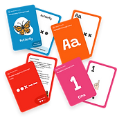
Urban Griot Playground (UGP) is an EdTech research project that teaches STEM and early literacy to children aged 3–6 through African drumming traditions, using rhythm, movement, and cultural storytelling as the medium for learning letters, patterns, and language.
The kit had been developed and theoretically grounded in Cultural Historical Activity Theory. But it had never been placed in real users' hands. Before investing in a costly, relationship-sensitive family pilot with Black, Brown, and Indigenous communities, the learning kit needed rigorous validation.
Launching a confusing product to underrepresented families wouldn't just waste their time, it would erode trust in culturally responsive EdTech and set back a mission that matters. We had one shot to get this right before going to the community.
The Real Risk

WHERE I JOINED
The kit existed. The question was: does it actually work?
I joined at Phase 2, after the learning kit had been developed but before it had been put in front of any real families. My mandate was to design and lead the validation research that would determine whether the kit was pilot-ready, and to build the systems, research processes, documentation, and a digital companion product, that would carry it forward.
Phase 1 — Before I joined
Kit developed. Curriculum designed around Cultural Historical Activity Theory. Academic theory validated. Physical prototypes built.
Phase 2 — My Scope (12 months)
Expert-user validation via co-design. Thematic analysis and research infrastructure. Design iteration on all four critical blockers. Digital companion MVP designed and built.
Phase 3 — After my involvement
Family pilot with target communities. Kit approved as pilot-ready. Expanding partnerships with daycare centers and early learning providers.
.jpg)
HOW MIGHT WE
Validate product readiness before costly pilot investment?
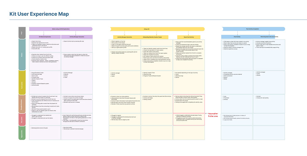
I created a user experience map to analyze and create hypotheses with the team on where the users might get stuck and cause friction/confusion in the experience. ie

RESEARCH STRATEGY
Why design students and educators before families, and why that was the right call
Rather than going straight to families, I proposed an expert-user validation strategy: run co-design clinics with graduate design students, educators, and researchers who could articulate friction fast and survive a confusing experience without abandoning the study.

My reasoning: If trained designers can't figure out how to use the kit without guidance, neither will a busy parent at home with a 4-year-old. Expert users expose the real structural problems, not just surface usability, and they can tell us why something fails, not just that it does.

I designed a structured clinic series in which each session addressed a specific evaluation question, using distinct methods for each. This wasn't one repeated workshop; each clinic had different stakeholder compositions, different facilitation flows, and different analysis frames.
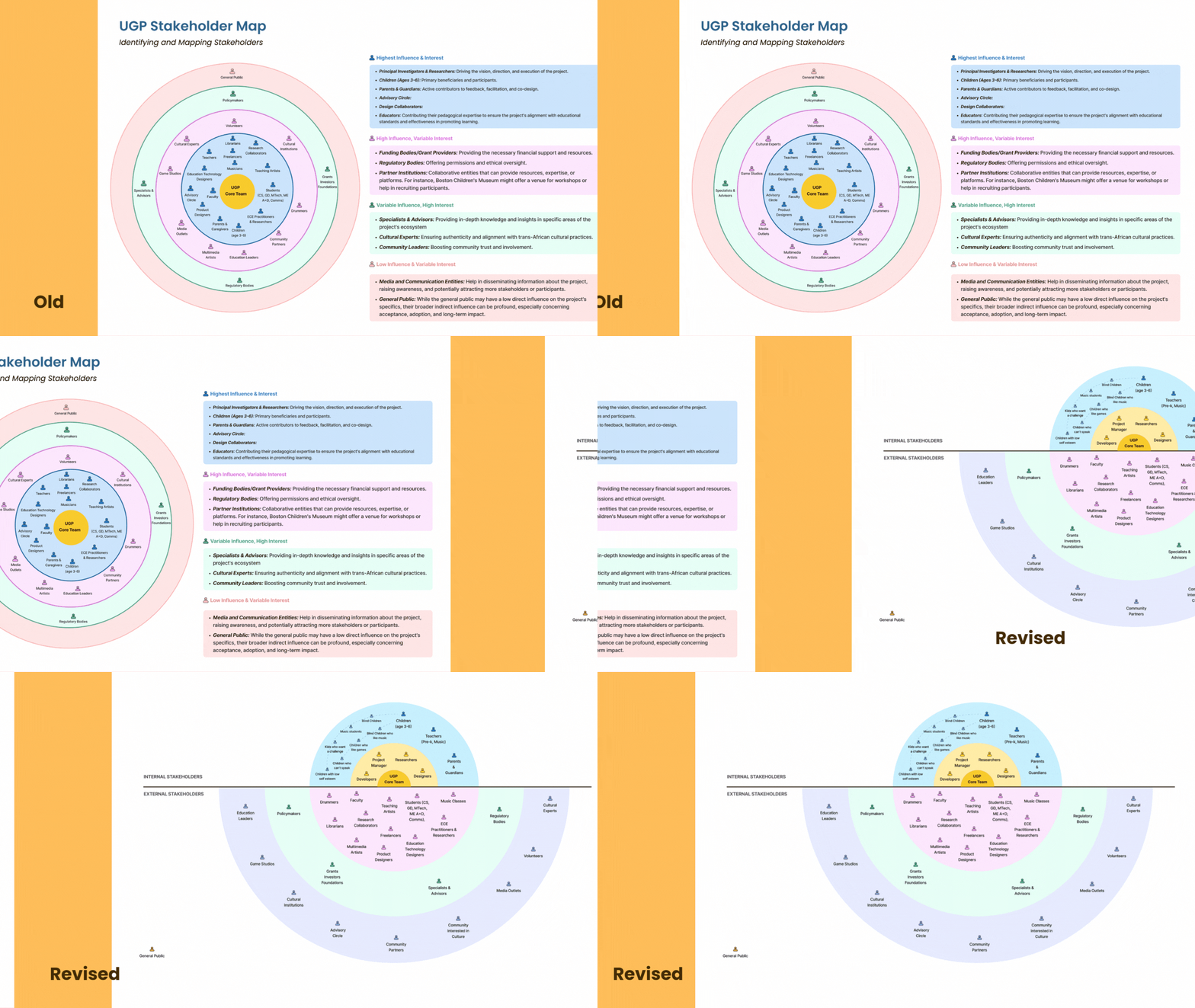
01. Stakeholder Mapping Workshop
How well does the product's target community map match reality?
METHOD
Participatory mapping exercise: Participants independently mapped who they thought the kit was for, then compared and discussed gaps with the existing stakeholder model.
FINDING
Participants identified underrepresented stakeholders not in the original map: school counsellors, occupational therapists, librarians, and children with communication challenges, which expanded the product's potential reach.


SOLUTION
I rebuilt the stakeholder map, grouping by role and influence, giving the team a clear prioritized view of who drives adoption vs. who is a secondary beneficiary.
02. Elements Evaluation Workshop
Do the activity cards communicate their purpose clearly and independently?
METHOD
Unguided card exploration followed by "parent/child" role-play, participants attempted to run an activity with no instructions and we observed where they got stuck.
FINDING
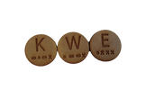
85% of participants couldn't determine the educational purpose of the rhythm tokens, the most central physical component. Even education professionals felt lost within the first 2 minutes.
SOLUTION
I designed a sample activity that ships inside the kit, a low-stakes, pre-structured play session that teaches parents how tokens work before they try to run a real quest card. The decision to use a physical sample (not just a video) was deliberate: it preserved the tactile, embodied nature of the kit's core pedagogy.
Tokens


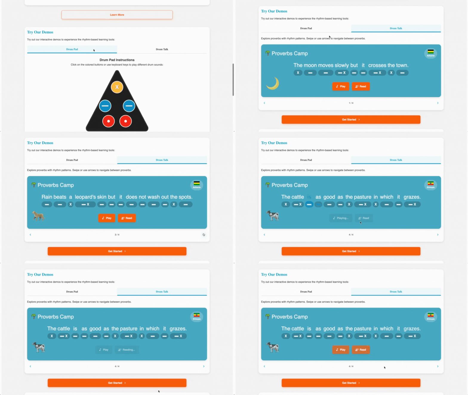
Guided sample activity that walks users through when, why, and how to use tokens
03. Learning Kit Ecosystem Workshop
Do the activity cards communicate their purpose clearly and independently?
METHOD
Full-kit simulation with instant surveys after each component interaction, followed by a structured group debrief using a modified STOP/START/CONTINUE framework.
FINDING
Cultural richness was praised, but participants struggled with figuring out "how to use the kit". The camp map was underutilized as a flat static poster. Integration between components felt disconnected
SOLUTION
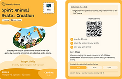
1. Rather than just adding instructions to the box lid (which people wouldn't read), I designed a first-use journey: a QR code on the kit → a 3-minute walkthrough video → landing directly in the digital companion app. The QR code made the jump from physical to digital feel intentional, not bolted on. This connected the two products in a single first impression.

QR code that leads to a walkthrough video


Camp map turned into a progress tracker with reusable stickers
2. Rather than redesigning the camp map poster (expensive, wasteful), I repurposed it by adding a sticker mechanic, children place a reusable sticker on each camp zone when they complete it. This cost nothing, preserved the existing asset, and gave children visible agency over their progress
The walkthrough video opens on the digital companion platform
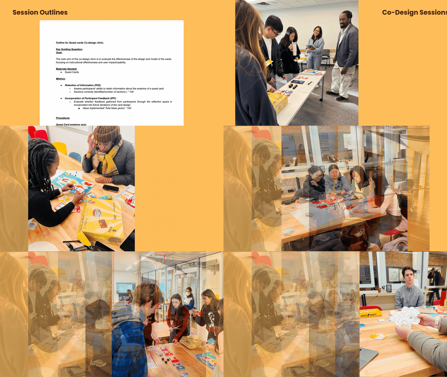
DIGITAL PRODUCT
Turning qualitative + quantitative data into decisions the team could act on
After each clinic, I led a full thematic analysis, not just note summaries. I built a codebook with clear definitions and worked with the team to code transcripts consistently, then developed a theme frequency table to prioritize by how often an issue appeared, combined with its severity and feasibility to address.
Why this mattered: Without a codebook and consistent tagging, every team member was interpreting feedback through their own lens. I built the infrastructure so that future research studies, not just this one, could produce comparable, trustworthy insights.


The analysis also served a second purpose: I created reusable facilitation guides and data templates so that any team member could run future co-design sessions without reinventing the process. This reduced team decision-making by roughly 60%.
OUTCOMES
What changed because of this work
The pilot validation wasn't just checkbox research, it produced measurable changes to the product, the team, and the project's trajectory.
✓
Kit approved as pilot-ready by academic leadership, the primary milestone of the entire 12-month engagement
40%
Increase in family pilot
sign-ups after launch
~60%
Reduction in cross-team decision-making confusion after centralized IA and role-clarification workshop
85%→15%
Reduction in kit onboarding confusion


SYSTEMS & TEAM IMPACT PRODUCT
Turning qualitative + quantitative data into decisions the team could act on
One of my less visible but high-leverage contributions was building the research and process infrastructure that the team would use long after my involvement. Without this, every future co-design session would require rebuilding from scratch.
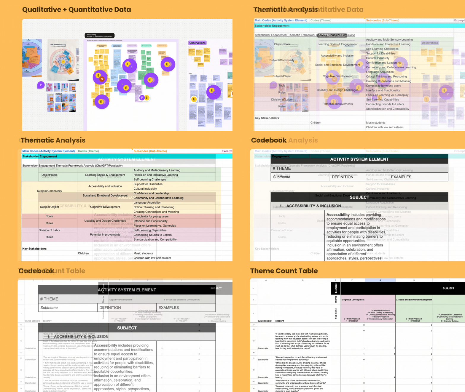

01. Research infrastructure I built
-
Reusable facilitation guides with session-by-session flow, timing, and facilitation tips, so that any team member can run a workshop without reinventing it.
-
Central codebook with clear definitions and real examples for consistent thematic coding across the research team.
-
Theme frequency table that tracks patterns across sessions, making it easy to see what's recurring vs. one-off feedback.
02. Team and workflow improvements
-
Role clarification workshop aligned each team member's responsibilities with their actual strengths, reduced ambiguity that had been slowing decisions.
-
Centralized information architecture across the project cut cross-team confusion by ~60% and gave the team a shared language for prioritizing features.
-
Marketing collateral and a pitch deck to communicate the kit's value to families, educators, and potential institutional partners.
REFLECTIONS
What I learned and what I'd do differently
WHAT WORKED
The expert-user strategy was exactly right. Design students could articulate what went wrong and why in ways that families in a 60-minute session couldn't. Running three focused clinics rather than one broad session produced much sharper insights, each clinic had one research question and answered it clearly.
WHAT SURPRISED ME
The cultural resonance came through strongly in every session, even from participants with no prior connection to African drumming traditions. The hardest problem wasn't convincing people the kit mattered. It was making it legible enough that people could act on that belief.
WHAT I'D DO DIFFERENTLY
I'd instrument the digital companion app from day one, we had strong qualitative data but limited usage metrics. Understanding which parent features actually got opened (vs. which we assumed they'd want) would have sharpened the v2 roadmap significantly.
WHAT I'D TELL OTHER DESIGNERS
Build the infrastructure, not just the deliverable. The codebook and facilitation guides took extra time upfront, but they're the reason this research produced durable insights rather than a one-time report that sat in a folder.
