FindHer
B2C Web App (MVP)
Empowering women in India to close the gender employment gap

Role:
UX Deisgner
- Desk Research
- User Interview
- Note-taking
- Logo Design & Brand Guide
- Collaborative Sitemap
- Wireframing
- Key Feature Design
Team:
4 Designers
7 Developers
1 Project Lead
Timeline:
4 Months
Organization:
Generate Product Development Studio at Northeastern University
Tools:
Figma
Miro
Context
During Spring 2023, I was a UI/UX Designer at Generate Product Development, where I worked with a team of 12 students having different backgrounds to build an MVP of the client project, FindHer, from scratch.
What's FindHer?
FindHer is a job search web app that empowers women in India to search for employment and enter the workforce. The web app is unique for its dating app-like matching, where both job applicants and businesses can be users and determine top matches with the other sides’ profiles.
Problem:
India's 2020 Labor Force Participation Rate
*percent of people employed or actively seeking employment
24.8%
Women
vs
72%
Men
A major reason for this stark difference is the stigmatization of working women in India, leaving women to care for the household instead of pursuing career growth. Even when employed, women are still expected to take on the brunt of household and family responsibilities, causing companies to view women as less dependable when it comes to work.
A job search web-app that finds optimal matches between applicants and businesses through upfront policies and genuine user profiles.
Solution:
01
Questionnaire
Applicants determine what they need from their jobs.

02
Personality-first applicant profile
Lets applicants show off their true selves and priorities.
03
Transparent company profile
Displays company details, benefits, and culture upfront

Our
Approach:
COMPETITIVE ANALYSIS
Competitors lack personalized job/company matches and in-depth search functions for Indian women.

USER INTERVIEWS
Applicants want a comprehensive profile and seek transparency from companies.
The team didn't have a great conception of the problem at hand, so we interviewed 4 Indian women who were currently working in India to better understand their job search pain points. I worked with another designer
to research user interview best practices, and together we wrote our interview questions. We found that:
😕Applications lack personal touch
Our interviewees felt like they only got to highlight their technical skills rather than their philosophies and personalities.
😕The interview process lacks communication
Interviewees were often unsure when they might hear back from companies or about next steps. Getting ghosted was a common theme as well.
😕The company’s treatment towards women should be clear
Are women treated well at this company? Does this company provide maternity leave? etc.
How might we prioritize transparency and enable users to fully represent themselves on a job platform?
Problem
Statement:
LOW-FI WIREFRAMES—APPLICANT & BUSINESS PROFILES
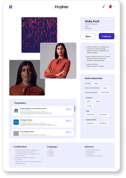
Personable profiles inspired by dating apps
Traditional job profiles felt uninspiring and sterile to me. Since one interview insight was to add more personality into profiles, I took inspiration from dating apps like Hinge and Bumble to make personable and comprehensive profiles with pictures, video statements, and
layouts that highlighted these features.

A

B

C
ITERATIONS - APPLICANT & BUSINESS PROFILES
After getting feedback from the team, we went with Design A since it was unique and strongly emphasized the applicant's personal section (pictures and video statement).
Changes included:
→ Removing the navigation bar since the compact layout made it unnecessary
→ Replacing the "About" card with questionnaire responses to make users' preferences explicit
→ Making the "Experience" section scrollable to minimize the need for page traveling


LO-FI WIREFRAMES - APPLICANT & BUSINESS QUESTIONNAIRES
To make the questions more digestible, we created a segmented, click-through design. The responses here would appear on users' profiles, so each question was isolated for better focus. I initially explored a non-segmented scrolling design but decided a segmented version would be better to avoid the overwhelming feeling of an endless scroll.


ITERATIONS - APPLICANT & BUSINESS QUESTIONNAIRES
Changes included:
→ Removing the small dots from the progress bar for cleaner UI
→ Adding ranking-type questions for better profile matches
→ Repositioning the "Back" and "Next" arrows for a more continuous flow
→ Removing the illustration for cleaner UI


MORE HI-FIS


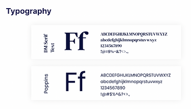
VISUAL IDENTITY


CHALLENGES & TAKEAWAYS
MVP comes first.
Since this project began from scratch, the scope was fairly large and there were several ideas we weren't able to design because the MVP came first. Although I brought up some suggestions, I learned the importance of focusing on the "Must-haves" to stay on track and deliver an MVP on time.
Client communication is crucial.
There was some confusion with the platform's logistics which required us to reach out to the client. I learned that it's important to regularly check in with the client about questions since their vision and input are important to building a successful product.
THINGS I WOULD DO DIFFERENTLY
Cut down the scope
The breadth of features we needed to design took away from the depth, making it hard to polish each feature. I would've liked to spend more time tweaking and testing a design than rapidly producing many features.
Conduct user testing
I'm interested in how intuitive our product is and how the branding would be received. This was a semester-long project only, so unfortunately, I haven't been able to follow up on its progress.
.png)
.png)


.png)